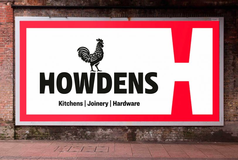
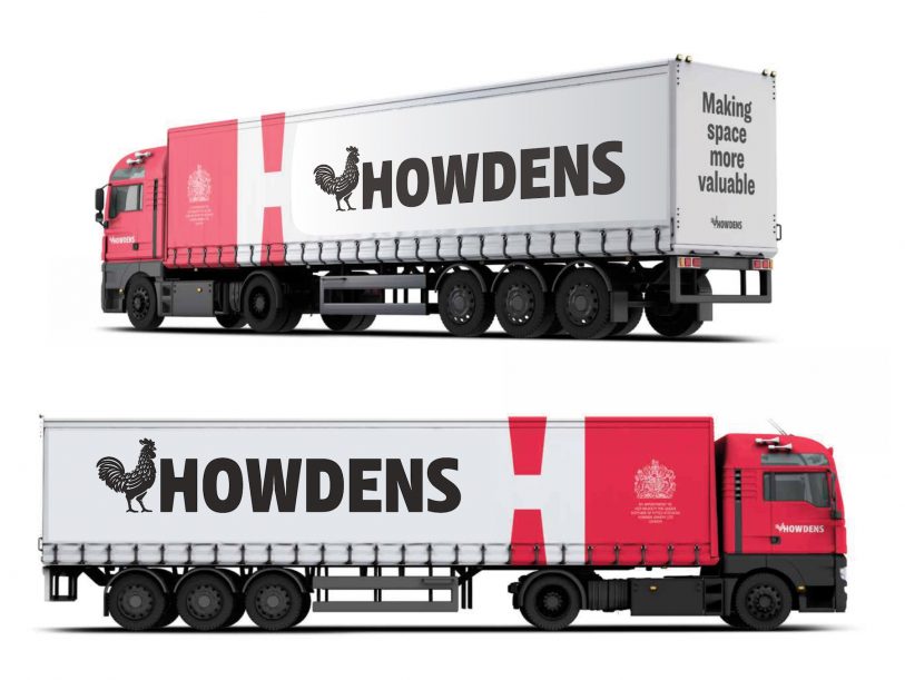
KONTAKT:
info@albertmorell.com +49 1590 64 00 847

HOWDENS

The brief:  To modernize a rooster logo.

The context: In 2018, the London based brand specialists at checklankindleysides commissioned me to revamp the old rooster logo for the brand identity relaunch of UK’s number 1 kitchen and joinery supplier Howdens.

What I did: The design-team asked me to reshape and modernize the old and slightly dated Howdens rooster illustration. I aimed to give him a proud look and bold stance, adding precise feather details and create a shape, that harmonizes with the look and feel of the new Howdens typeface.

Privacy Settings
We use cookies to enhance your experience while using our website. If you are using our Services via a browser you can restrict, block or remove cookies through your web browser settings. We also use content and scripts from third parties that may use tracking technologies. You can selectively provide your consent below to allow such third party embeds. For complete information about the cookies we use, data we collect and how we process them, please check our Privacy Policy
Youtube
Consent to display content from - Youtube
Vimeo
Consent to display content from - Vimeo
Google Maps
Consent to display content from - Google