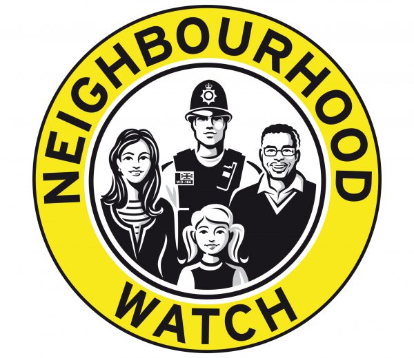

Neighbourhood Watch
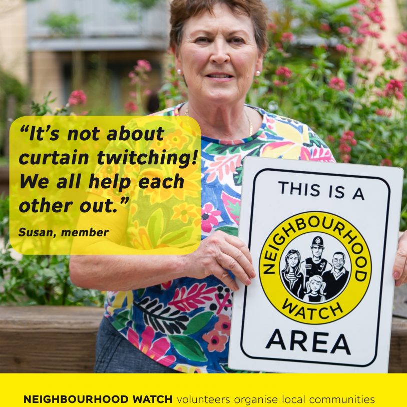
The brief: Redrawing of the iconic NW roundel.
The context: London based creative brand strategists Mellor&Smith were commissioned by the UK network of Neighbourhood Watch to re-vitalize the brand icon and corporate identity. The old version of the iconic roundel illustration, containing a family of citizens and a bobby, has been labeled outdated, not well crafted and uncompetitive for further use.
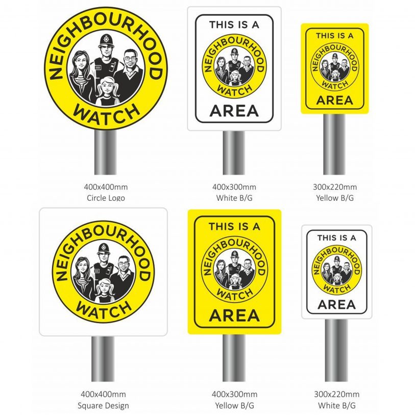
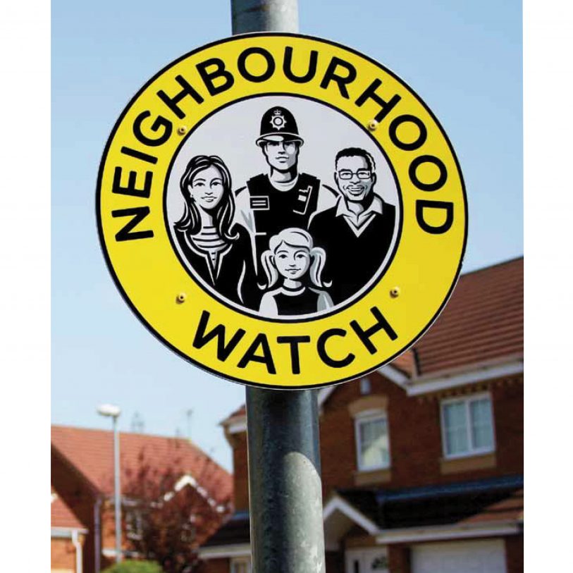
What I did: My challenge, in order to give the roundel icon a face lift, was to make it look fresher, more contemporary while remaining completely recognizable. The new icon has been launched successfully in 2016.
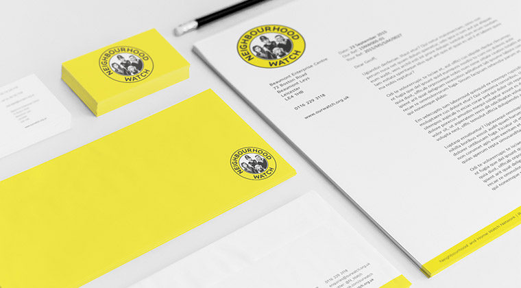
Branding & concept: Mellor&Smith