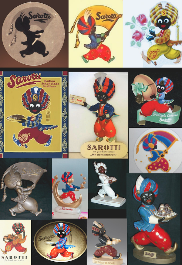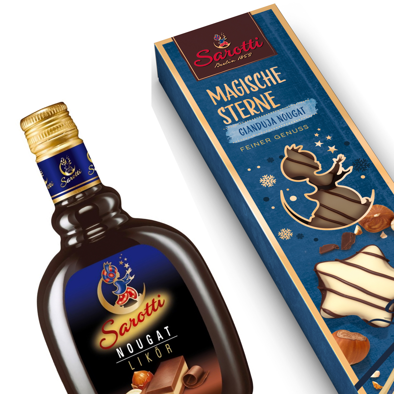

Sarotti
The brief: Full re-vitalization of a traditional chocolate brand key visual.
The context: The Sarotti brand is full of history, dating back to the year 1852. Generations of kids grew up with this brand icon, which changed its appearance various times over the past decades. Over the years, the so called “Sarotti negro” in all its various shapes and sizes became sought after collectors items. Yet, growing concerns about the ethnic insensitivity of such outdated brand icon usage were issued. In order to distancing from any association with the previous ethnic background of the older icon versions, the new racial neutral brand figure was renamed “The magician”. Owner and manufacturer company Stollwerk commissioned the overdue brand re-vitalization in 2004, including the optimization of all package designs for a vast range of different chocolate products.
What I did: Challenge for my redraw was to maintain the friendly & open gesture and body posture of the little boy figure, while slightly modernizing the look, maintaining the recognizability of the icon. In order to add a more playful and poetic note, it was decided to get rid of the flag and to add some magic stardust.
Concept & branding: Peter Schmidt Group BBDO