GELATO & SORBETTO
...it's ice ice, baby!
Cheers to David Restivo ( Montana,USA) , who made his dream come true to be a passionate gelato and sorbetto maker.
Besides his full-time job, managing the National Park Service’s nationwide NPS.gov website, he started to sell freshly home made gelato from his refrigerated pedal-powered gelato cart.
I had the pleasure to provide him with a bespoke new illustrative logo for his new venture, aimed for various usages.
More information:
www.blauerpanther.com/award/


BLAUER PANTHER
Refresh of an awards logo...
I had the pleasure to join the Munich-based brand consultants BDA CREATIVE design team to craft the new panther logo.
The BLAUER PANTHER TV & Streaming Award aims to honour the efforts and working results of the German TV and film industry.
The big ceremony night on the 19th of October 2022 brought bright smiles and some happy award winners, including Arnold Schwarzenegger.
More information:
www.youtube.com/watch?v=32ZqyoLpdfg
www.blauerpanther.com/award/


GAISBOCK
Swiss skincare!
BERG & KRAFT is a Swiss company, that produces sustainable natural and useful quality products for everyday use – for the well-being of body, mind and soul.
They asked me to create the logo of a Capricorn “Gentleman” for use on their new men’s skincare and fragrance range called “GAISBOCK”. Thanks for this fun project!
More information: www.bergundkraft.com/gaisbock/ #artdirectress


KAISER-NATRON
My first redraw since 100 years became an Award winner!
I am very excited to share that one of my illustrations helped to pick up two awards for “Excellence in “Brand Strategy and Creation” and for “Brand Design/Product Brand”.
My happy clients, Hamburg based brand consultants SOULMATES have been recognized for their successful rebranding and modernization of one of Germany’s oldest household brands, KAISER-NATRON.
The brand is known to many for it’s healing effects. It is used in detoxification and healthy cooking, as well as for hygiene and beauty. The environmentally friendly home remedy baking soda (sodium bicarbonate) replaces numerous commercially available products at a reasonable price. In the household, the non-toxic baking soda is used, among other things, as an all-purpose cleaner, in the kitchen as a raising agent, in cosmetics for vitalization.
Congratulations to the SOULMATES design team!
You can see the Award details here: https://www.german-brand-award.com/preistraeger/galerie/detail/40970-kaiser-natronr-marken-und-produktrelaunch


VAILLANT GROUP
Keep calm and hop on !
Project:The Munich based brand identity design consultants at “Zeichen & Wunder” are responsible for the branding of the VAILLANT GROUP, Germany’s leading company for producing high-efficiency solutions in heating, energy-saving ventilation and air conditioning technology.
They asked me to assist with the rejuvenation of the iconic and beloved Vaillant Rabbit brand logo, which have been redesigned various times since the first “Rabbit in an egg” draft of 1899.
It was a pleasure to join the Z&W design-team and be trusted in helping to refine and slightly simplify details of the Rabbit’s face shape and form. The focus was to maintain the open and friendly facial expression, without losing a degree of similarity to the previous logo version. And finally, to get rid of the 3-D look for good.
Use: One major technical factor to consider was, to create one single version of the logo, for a unified use in various printing techniques, such as chrome electroforming, steel embossing, laser engraving and digital print on lacquered casings, for a multitude of Vaillant products and packagings.
All conceptual ideas/overall brand identity design by Zeichen & Wunder


AUNT BESSIE’S
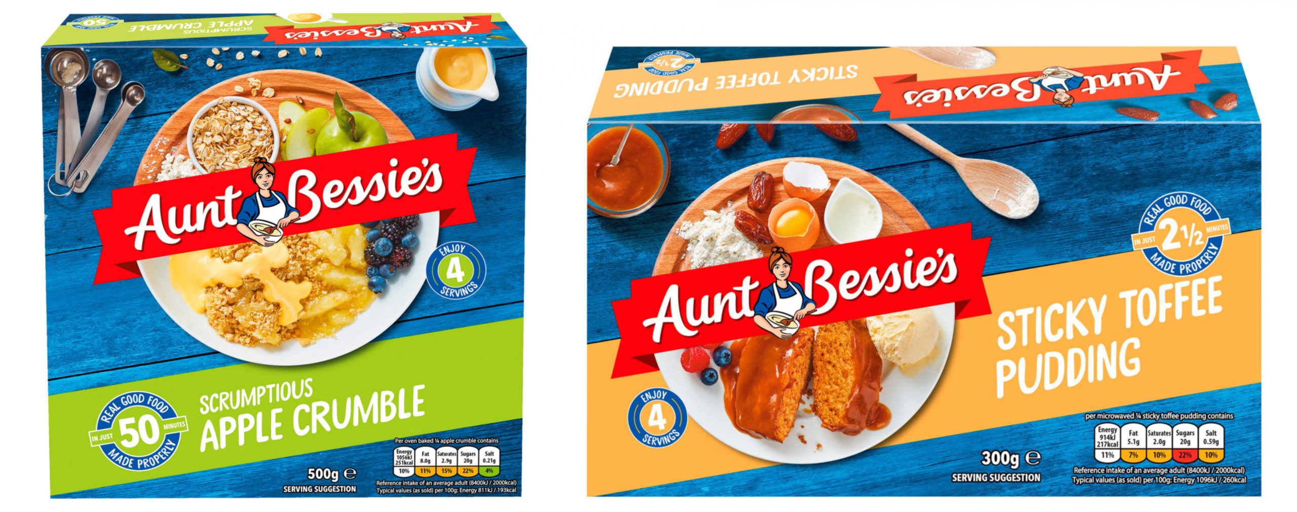
Aunt Bessie’s unveils new packaging and logo!
Project:
Aunt Bessie’s has redesigned its entire portfolio with a new look to better appeal to the modern-day shopper. I rejuvenated the old illustrative Aunt Bessie’s version just slightly while keeping her appearance friendly and familiar. The updated logo supports the brand’s ethos of providing ‘food as it should be’.
Brand:
Aunt Bessie’s, by Nomad Food, is a leading frozen food company in the United Kingdom where it manufactures, distributes and sells a range of branded frozen food products.
Use:
Brand identity, product launch in 2020, packaging, all media.
Creative direction:
Parker Williams, London


THOMY
Summer is here, and it's BBQ season again!
Project:
It was my pleasure to be tasked with creating a family of illustrative design elements, for a range of ten new gourmet sauces. All ornamental parts had to fit within the label layout frame, adapting around the typo and be eye-catching. The aim was to differentiate each exotic flavour theme while maintaining an overall continuity with the illustration’s look and feel.
Brand:
Thomy is a mustard, mayonnaise, sauces and dressings brand Launched in 1930, was acquired by Nestlé in 1971 and is a trusted household name in Switzerland and Germany.
Use:
Sauce bottle/neckbottle labels for the product launch in 2020, all media.
Creative direction:
TaxiStudio, Bristol


PAULANER
Bavarian traditions, a monk and lot's of beer!
Project:
Reinterpretation of a traditional Bavarian beer garden illustration for a popular beer brand relaunch. The client directed me to recreate the previous beer garden scene from the 1990ies, to appear like a folkloristic vintage original, with a slight woodcut or etching feel to it. I had to create two versions, each for separate packaging implementations.
Brand:
Paulaner is a German brewery, established in 1634 in Munich by the Minim friars of the Neudeck ob der Au cloister,
and is one of the six breweries who provide beer for Oktoberfest, the German beer festival dating from 1810.
Paulaner ranks number six among Germany’s best selling beers.
Use:
Paulaner Weißbier bottles and beercan labels and packaging, all media.
Creative direction:
Higgins Design, Hamburg


LORO PIANA
Gifts for all Urban Explorers, Adventurers and Travel Seekers !
Project:
I was asked to create four illustrations in a simplified graphic vintage style, framed by a stamp shaped layout. The aim was to cause associations to a world of classic and luxurious travel, from urban destinations to the mountains and beaches. The four travel motifs found their way into the seasonal holiday gifts catalogue, on various store decorative items and Loro Piana store window displays.
Brand:
Loro Piana/LVMH is an Italian fabrics and clothing company specializing in high-end, luxury cashmere and wool products.
Use:
European seasonal Winter campaign 2019, store decoration, store window decoration, catalogue print and multimedia, various accessories and clothing items.
Creative direction:
Checklandkindleysides, London


