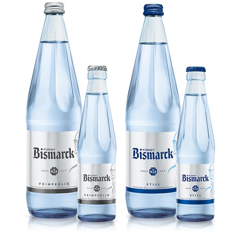
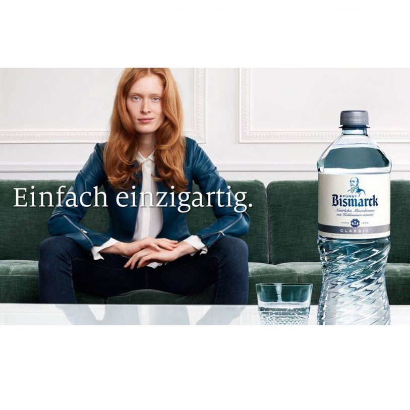
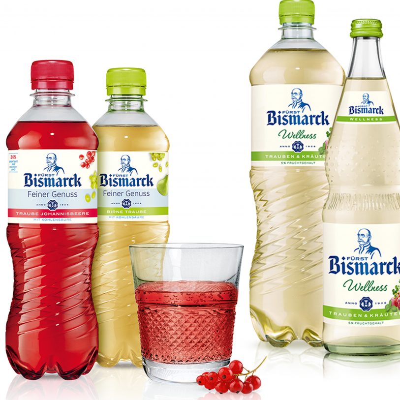
KONTAKT:
info@albertmorell.com +49 1590 64 00 847

Fürst Bismarck

FÜRST BISMACK

The brief: Rejuvenation of established Table Water Trademark.

The context: Fürst Bismarck is a prominent German table water & beverage brand, which has been popular since generations.The source springs are located in the area called Sachsenwald, near the northern german city of Hamburg.The legend says, the former German Chancellor  discovered the source during one of his forest walks, after he retired from his political life.

What I did: Right after the change of the brands ownership in 2017,  decisions about a long overdue redesign of the brand were made.  Hamburg based brand specialists justblue called me to assist whith the redrawing and modernization  of the old Bismarck portrait.  My design brief for the new depiction was mainly about to simplify, to soften the rather preussian militarian stance of the portrait, to make the the person Fürst Bismarck appear more human, friendly and approachable.


HOWDENS

HOWDENS

The brief:  To modernize a rooster logo.

The context: In 2018, the London based brand specialists at checklankindleysides commissioned me to revamp the old rooster logo for the brand identity relaunch of UK’s number 1 kitchen and joinery supplier Howdens.

What I did: The design-team asked me to reshape and modernize the old and slightly dated Howdens rooster illustration. I aimed to give him a proud look and bold stance, adding precise feather details and create a shape, that harmonizes with the look and feel of the new Howdens typeface.


ChongQing

Chong Qing

The brief:  Illustrated key visual for relaunch of beer brand label.

The context: While expanding further into the fast growing Asian market, the Danish brewing conglomerate Carlsberg Group aquired the regional chinese Chongqing Beer Group in 2013. In 2015, a full brand makeover took place, directed by Singapore based brand strategists DesignBridge. Out of several design routes, this „hot pot“ themed illustration finally was chosen for labeling the bottles and cans.

What I did: I created a „hot pot“ illustration, using loose line drawings while referring to asian aesthetics and traditional ornaments. The „hot pot“ is boiling with ingredients like barley and hops, referring to the brewing process. The lively upwards movement of the ingredients also symbolizes the vitality and dynamics of the Chongqing city area (Population 18 Mio. people) and reflects chinese festive traditions.


MARS Galaxy confectionery

MARS Galaxy confectionery

The brief:  To create a range of individualised, seasonal On-Pack illustrations.

The context: London based branding experts Elmwood worked on the redesign of various Galaxy chocolate packagings for their client, global confectionery & foods leader Mars Inc.New ideas were developed for a variety of seasonal festive-themed packaging designs, as well as for the Galaxy International Travel Retail product range. Besides the festive Christmas and Easter theme, special Eid-themed Arabic elements needed to be crafted for the Galaxy Jewels special-edition casket, aimed for the Middle East market during the Ramadan season.

 What I did: The main goal for this project was, to create kind of „magical swooshes“, containing a harmonious array of specific festive symbols. For each On-Pack layout, individually crafted illustrations were required. My focus was about finding the right balance and precision, to bring all elements together, in order to create an easy dynamic flow. Good printability was also key, especially to avoid filled-in areas.


BAER Suisse

BAER

The brief: Creation of a brand identity icon.

The context: Leading Swiss Camembert manufacturer BAER commissioned German brand specialist I.F.P with a brand relaunch.

What I did: I was asked to redraft and modernize the „cheesmaster“ illustration, with a focus on a younger and friendlier appearance.


Doncaster

DONCASTER

The brief: Rejuvenation and modernization of traditional crest.

The context: Doncaster is a large market town in South Yorkshire, England. Together with its surrounding suburbs and settlements, the town forms part of the Metropolitan Borough of Doncaster. The Borough was formed by the amalgamation of various Urban and Rural Districts, the last Coat of Arms was officially granted in 1975.
The old version of the shield was half black and half green to represent the union of industrial and rural areas in the borough. The castle is actually a Port between two towers and comes from the old Doncaster arms. Around are placed eight white roses, the symbol of Yorkshire for the eight Yorkshire councils combined. The ermine cushion in the crest was found in the old Doncaster arms. The owl is a symbol of wisdom. On either side is an oak branch one for each rural district combined in the new borough. The sitting lions were used as supporters of the old Doncaster arms. Each has a distinctive collar. The dexter lion has a collar forming a version of the British Rail logo. This shows the importance of Doncaster as a railway town. From the collar hangs a miner’s lamp, for coal mining. The sinister lion has a lightning flash for a collar, symbolic of electricity generation. From this hangs an anchor for shipping. The Motto says „Be Steadfast“, meaning „resolutely or dutifully firm and unwavering“.

What I did: Yorkshire based branding agency ledgardjepson asked me to lay my hands on the crest, in order to create a rejuvenated and modernized version. The overall details and combination of elements were meant to be maintained alike the old version, but to be drawn and crafted in a more modern and precise way. A positive, as well as reversed version, were required.


LYONS

LYONS

The brief:  Redrawing & modernisation of the iconic Lyons „Nippy“ teashop waitress.

The context: The first Lyons teashop opened in the year 1894 in Picadilly, by 1940 there were about 250 shops throughout the country and in the 1950`s, Lyons began marketing attractively packaged cakes for sale through grocery outlets.Begin of 2012, the London based creative brand strategists Jones Knowles Ritchie rediscovered and celebrated the brand`s rich heritage, creating a range of fresh, contemporary cake packagings for client Premier Foods.

What I did: Create a open and friendly looking Nippy waitress. Limited to 2 colours, adding some plasticy and a reference to some elements of her old uniform.


STUDIO BABELSBERG

STUDIO BABELSBERG

The brief: Development of a new illustrated brand key visual.


The context: Studio Babelsberg is the oldest large-scale film studio complex in the world and one of Europe’s leading service providers for feature films and TV productions. In recent years, various acclaimed directors produced major films there, from Roman Polanski to Quentin Tarantino. In 2012, the studio celebrated its 100 years jubilee. Back in the year 2003, then owners of the Babelsberg Studios, Universal/Vivendi, gave the commission for a rebranding to Hamburg based brand strategist BÜRO X under the direction of creative director Lo Breier.


What I did: During the key visual development process, some intense research in the history of the studio has been done. One of the most famous films ever produced at Babelsberg was Fritz Langs pioneering work METROPOLIS in 1926. As a result of the research, the head of the design team, Caroline Meyer, asked for my support to visualize some logo ideas, based on the films main character, Maria. Finally, the iconic film scene where the robot/cyborg is coming to live surrounded by electrical pulsating beams, became the main idea to create the new logo for the Babelsberg Studios. It took me countless optimization rounds to create a well balanced figure with the 4 circles, abstract but immediately recognizable. The final logo artwork is still in use, but over the years various changes have been made on the corporate logotype and naming. And the Studio Babelsberg success story continues…


BARNSLEY MUSEUMS TRUST

BARNSLEY MUSEUMS TRUST

The brief: Exploration of a new identity logo for the Barnsley Museums & Heritage Trust.


The context: Branding experts from LedgardJepson, also responsable in designing the successfull corporate identity makover for the Birmingham Museum, asked me for some explorations on a falcon. The Trust has been established as a fundraising body for Barnsley Museums. The main objective of the organisation is to raise money to support the wonderful venues, collections and the activities and programmes run by the service.


What I did: Creating a falcon with a lock. The falcon is related to the Barnsley history, the lock stands for a strong and trustworthy appearance. Challenge was to balance out a strong standing falcon, but with enough dynamic and drama in the wing movement.


Branding & concept: Ledgard Jepson, Leeds


ZARINFAR

ZARINFAR

The brief: Editorial portrait illustrations


The context: Cologne-based construction and planning firm Zarinfar provides its clients with a quarterly

editorial magazine. SSP Formfactor, responsible for the editorial design, asked me for a variety

of portrait illustrations.


What I did: The client requested to use portrait illustrations instead of portrait photos, to be done in a fresh illustrative style. My challenge: To reach a harmonious visual continuity throughout all illustrations, as well as a certain recognizability of the people the articles are about.


Privacy Settings
We use cookies to enhance your experience while using our website. If you are using our Services via a browser you can restrict, block or remove cookies through your web browser settings. We also use content and scripts from third parties that may use tracking technologies. You can selectively provide your consent below to allow such third party embeds. For complete information about the cookies we use, data we collect and how we process them, please check our Privacy Policy
Youtube
Consent to display content from - Youtube
Vimeo
Consent to display content from - Vimeo
Google Maps
Consent to display content from - Google